The New Skin Editor has Landed
Introducing the new Skin Editor from Isomorphic.
With the Skin Editor, you can now leverage the ability to cascade your changes to colors, font and borders to make wholesale adjustments with a simple click of a button.
You can see these changes instantly in both the editor and in Reify so you can quickly know how different settings will look together.
In this blog post, we take a deeper look at how our Skin Editor works and how you can leverage it to rapidly produce eye-catching skins in a fraction of the time it used to take.
Let’s get started!!
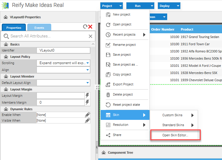
If you are a Reify user, you can access the online Skin Editor directly. Simply select Skin Editor from the dropdown menu.
Or you can get there by navigating directly to https://create.reify.com/themes (note: you will still have to have to log in to an enabled Reify account to access the online editor, even if you navigate there directly).
If you already have a downloaded version of the v12.1 SmartClient SDK, you can directly access the Skin Editor from the SmartClient SDK Explorer by selecting Tools, then Skin Editor.

If you are using SmartGWT, you can get access to the Skin Editor by:
- Inheriting module com.smartgwtee.tools.Tools to make the Skin Editor available in your SmartGWT project.
- Only skin resources inherited by your project will be available. So you should also inherit the skin that most closely fits your brand’s needs.
- For example, to make the Obsidian skin available, add: <inherits name=”com.smartclient.theme.obsidian.ObsidianResources”/>
- Run a GWT compile after any module file change to ensure it’s picked up.
- Navigate to project_name>/tools/skinTools/skinEditor.jsp.
Note – the Skin Editor tool uses Compass when compiling, so follow these links to install it on your computer.
http://www.ruby-lang.org/en/downloads/
http://www.compass-style.org/install/
Creating a New Theme
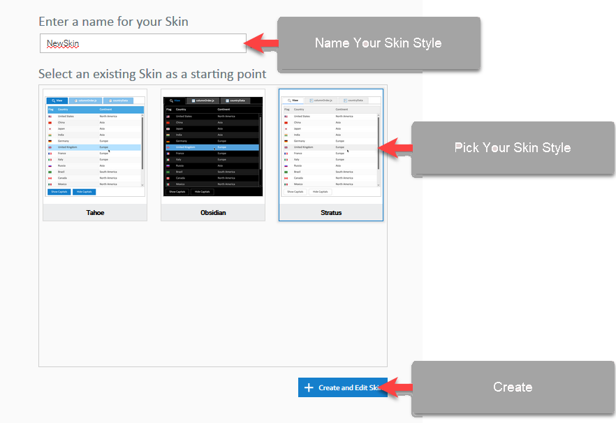
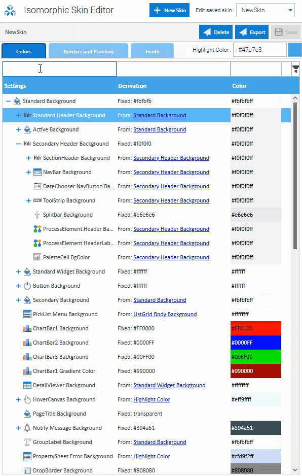
Pick an existing theme that is as close to the desired look and feel that you need, choose a name, and click Create. The theme will now be created for you automatically, ready for edit and the Skin Editor screen will be presented.
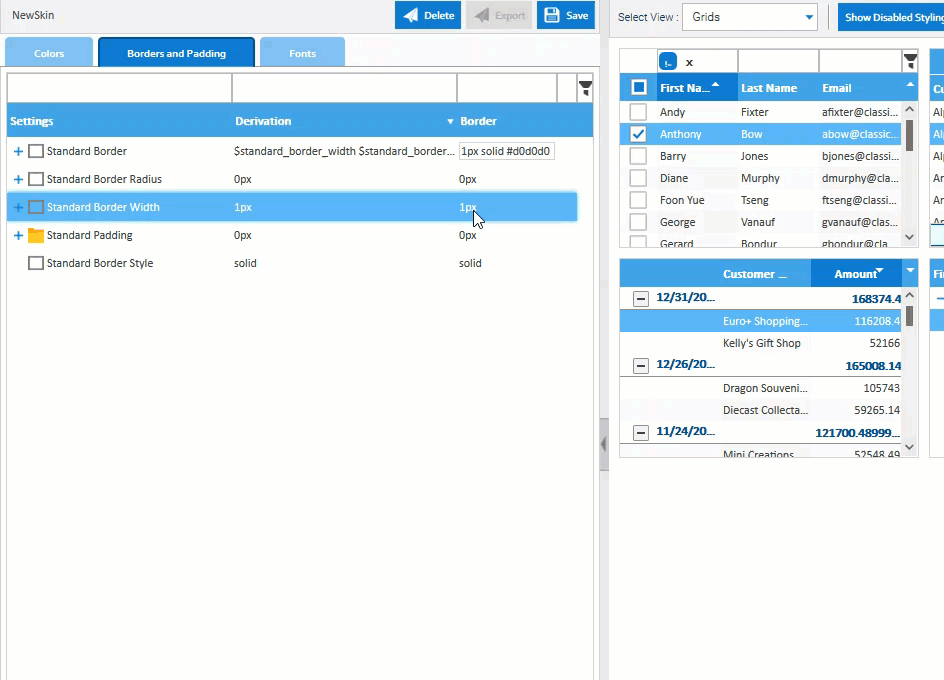
The Skin Editor management screen is split into 2 main areas:
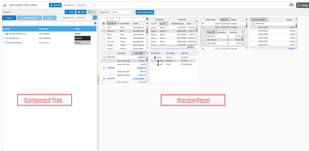
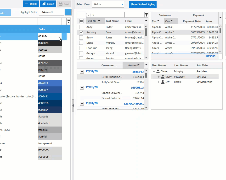
Component Tree – A cascading list of color schemes, fonts, border and padding settings that affect every component in the skin. This includes interactive behavior colors such as rollover, button up, down, focus and many more.
Preview Panel – A current and immediately updated view of how your changes to values in the Component Tree have affected the color schemes, borders, padding or fonts in the widgets and components on display.
Using the Component Tree
Open up the individual nodes to see all of the different elements that you can control.
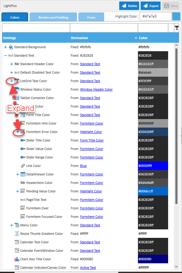
Filter the list so you can see just the elements you are interested in.
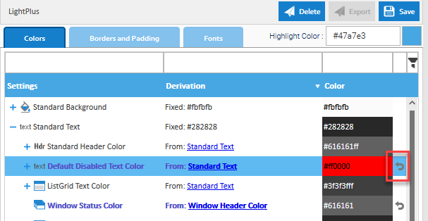
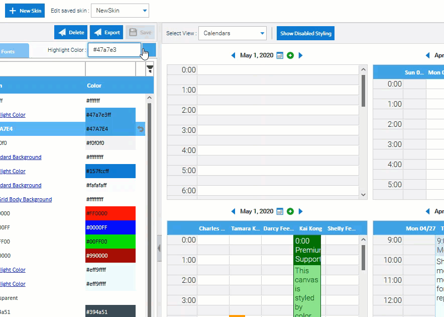
Use the built-in color picker to select a new color.

If you already know the color you want, simply click on the relevant component element, set your color ID and press enter to see your change immediately take effect.
If you don’t like the color, just revert the change – simple!!
Change border width or radius to get the desired look and feel you need. Borders and padding can be set at every component level for highly specific fine-tuning .
Change the font you use or it’s size. Header and body text can be manipulated in this way for all components.

Remember, all changes cascade down to any child elements associated with this component level, making development of your new skin fast, slick and easy.
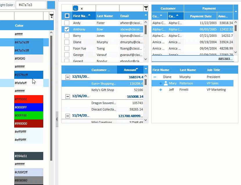
Preview Panel
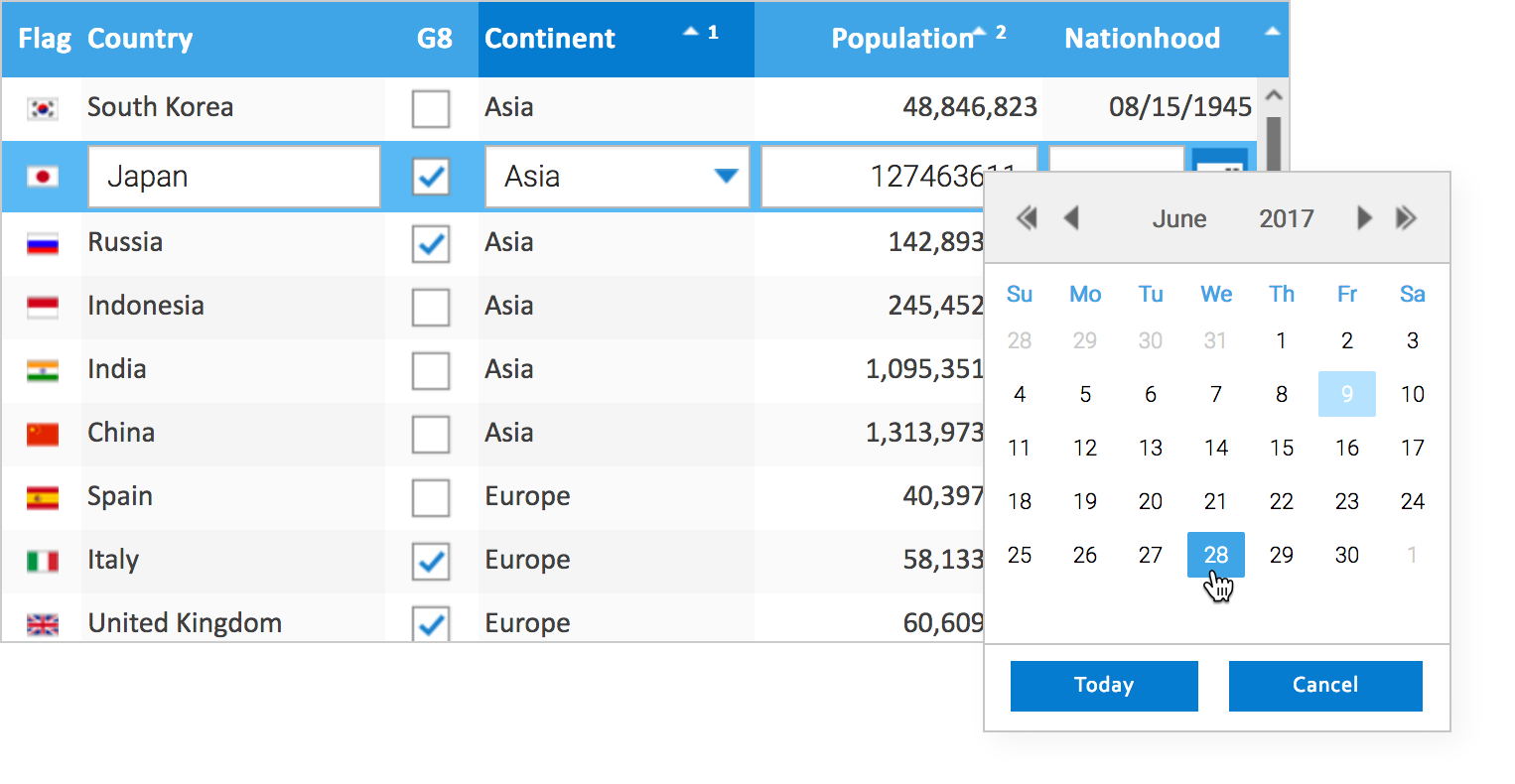
The Preview Panel is where your changes come to life. Change the selection of widgets you want to see so that you can individually model and control their color schemes, borders and fonts.

Save your changes as you go so you can return to your skin at any time to continue your work, without losing anything you’ve already done.

Once you’re finished designing your new skin, you can easily export it with the push of a button.
For SmartClient/Smart GWT projects, take the exported skin, place the skin into the skins repository of your SmartClient/Smart GWT project and change the bootstrap file to point to your new skin.
If you are using Reify and want to apply the new skin to the screens you are currently designing, simply select it as a custom skin and see the changes instantly get applied.

In v12.1, we can add additional SASS variables if you do not see them in the list of available and changeable elements, particularly if you see them in common use cases. You can log the request to the Isomorphic forums identifying the specific style you need/want, and we will work on adding it to the available SASS variables.
However, it is our intention and desire to continue to enhance the capabilities of the Skin Editor so that in v13.0 you will be able to edit any style, even if it doesn’t currently have SASS variables.
To use the online editor, you will need at least a Pro level version of SmartClient/SmartGWT to get access. You can purchase a Pro license here. If you have a Pro license, and you want to upgrade to 12.1 to use the new skin editor, then contact us to get a quote.
Want to get access to the online editor now through Reify? Contact us for a demo, or get started now by registering for a Reify account. We look forward to seeing you very soon!!


