Lessons learned from a prospect’s evaluation
We recently talked to a prospective customer about SmartClient. After all the usual introductions, they probed into the capabilities we offer, architecture, performance, etc. Then, we talked about how they would evaluate SmartClient.
They planned to use an example of a text input field their UE team had designed. It was very nice. It had all the states you would expect (normal, rollover, focus, etc.), tip text, error text, and even animation to transition the placeholder text to be a top-oriented field title. They asked if we could do this. We were somewhat surprised by the question, as frankly – while it really did look very nice – it seemed to be such a basic ‘test’ of our platform.
But, this also made us think a bit about how customers actually evaluate SmartClient.
You see, the client was testing our platform by building a beautiful login page. It was really not a UE you would typically use in the middle of a screen in an enterprise application for a number of reasons:
1. The placeholder text and the field title are usually not the same. If you have a phone number field the placeholder might be something like “XXX-XXX-XXXX”. You don’t want to take that and make it the field title. The field title needs to be “Phone number”. Same for most input hints: credit card number, case ID, whatever. The input hint is usually not the title.
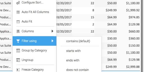
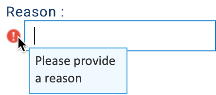
2. The validation error message was placed under the field. In an enterprise application, screen space is at a premium; that’s why our default error display is just an icon. When you inline the error message, suddenly the whole form gets taller, and you may have introduced scrolling and pushed input fields off the screen – all bad. Plus in a grid, you need to have just an icon because you can’t inline the error message, so it’s better to be consistent.
3. The animation of the input hint to the title – while it looked really nice – wouldn’t work well in a form that the user is going to be moving through quickly, tabbing from field to field, fingers never leaving the keyboard. Those neat animations become distracting noise.
Additionally, our best practices tell you not to use the SmartClient framework to build the login form, because the login page is your opportunity to start caching the SmartClient framework in the background while the user logs in. (See quick start guide – “Authentication and Authorization”).
By trying to replicate a carefully designed login form UE in SmartClient, they had chosen to evaluate us in precisely the area where weaker technologies like lightweight frameworks will seem to have strengths, and SmartClient will appear to have a weakness.
Frameworks like Angular and React encourage direct use of HTML elements, with minimalist wrapping, rather than using components that manage their own HTML. This “raw HTML” approach means it’s easy to just copy and paste some neat HTML & CSS3 tricks from the web and use Angular with the copied HTML. The tradeoff here is that using HTML directly means you run into lots of browser bugs. While browsers have improved quite a bit in terms of CSS3 rendering, there are still hundreds of bugs that appear when you try to do more advanced things: bugs related to focus management, finding out correct sizes for auto-sizing, bugs that only appear when you change HTML during event processing, etc.
That’s why in SmartClient, our default components render all the HTML for you, and we tell you not to depend on the details of the HTML we render. We need to change the HTML per-browser or sometimes even per-browser-version in order to work around browser bugs.
If you evaluate SmartClient by trying to replicate nifty CSS tricks you see on the web, things may seem more difficult than they are with the raw HTML approach, but you won’t run into the “reason” for that, which has to do with bizarre browser bugs which only arise when you try to do really hard things. Having built-in workarounds for such browser bugs saves you tremendous time further along in your process. But you won’t discover this if your evaluation involves just trying to replicate a specialized UE for a login form.
Finally, while it’s not as easy to use third-party HTML in SmartClient as compared to Angular, it is still straightforward in SmartClient. Let’s say that, for some reason, you end up with a very specialized input field like that discussed above somewhere in an enterprise UI (aside from login), and the CSS3 animated transition is considered a key requirement. You always have the option of just using an Angular component inside of your SmartClient application, to address such a corner case. Or you can use the HTML directly and just place it inside one of our HTMLFlow components, which is designed as a container for arbitrary HTML that you are going to manage yourself. Here are some docs on that
So, what lessons can be learned from this?
- When doing a SmartClient evaluation, identify the hardest thing to build and give it a go
- Don’t build your login page with SmartClient (enjoy the performance benefit)
- When considering technologies, understand where each technology plays well